Fantastic Fireworks is a British company that stages large-scale fireworks displays in Europe and the Far East.
Project Summary
The aim of this project was to successfully combine their informational display site and their e-commerce store into one site.
As I joined mid-way through the project, I was only responsible for:
- Revising information architecture
- Creating helpful product pages
- Writing new content for products
- Designing icons
Website Re-design
I was contracted to modernise their e-commerce site. The site was based on an existing site Buy Fantastic Fireworks. The layout and colours needed to stay similar, but a modern touch was required.
Old Website Design
Website Problems
The content presentation on a product page was not clear, and customers often missed imporant information. This meant that they either had to contact us directly or they went to our competitors who had clear videos/icons to highlight features of each firework.

Old Website Design
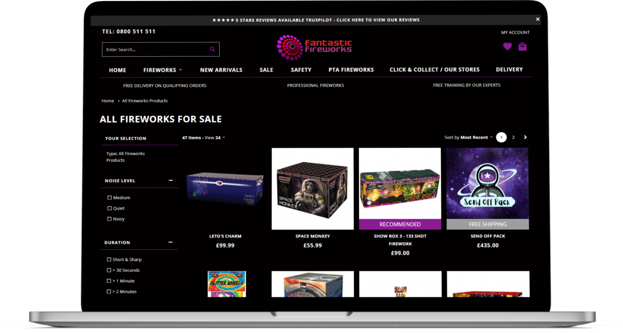
Product Page
As a result, I redesigned the product page with modern brand colours. It was also important to differentiate the shop and the display side of the site; lighter colours helped to achieve this.

Icons & Content
I added new visually striking icons to the product page as it was important for the user to get all the vital information like category, noise, number of shots etc. without having to read or view tables.
I also created an easy review process so that anyone who bought fireworks with us could automatically review the product without signing up. As previously this was detrimental to our review count.

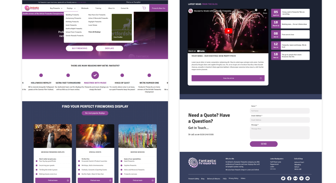
Sitemap
Since an e-commerce site was being added to an existing display site, it was important to reconsider the site structure. It was difficult to incorporate all of the business’ aspects without a mega menu.
The proposed mega menu would have the following sections to enable the user to navigate easily between the entire site.
- Display fireworks
- Shop fireworks
- Wholesale fireworks
- Training
- About us
- Contact us

Footer
The footer required a new design as it was outdated. Due to the addition of an e-commerce site, the footer needed to mimic the main navigation of the site and highlight our different categories (physical shops, e-commerce pages, displays and wholesale) and create a distinct visual hiearchy. The footer was essential in helping users to navigate to the information they needed.

Pop-ups
The origial pop-up was detrimental to user experience as it appeared before the user had a chance to interact with the content. As a result, I created pop-up that incorporated the logo, relevant shapes, colours and added placeholder text. The pop-up was also much shorter, making it easier for users to fill out and thus increasing conversions (especially for new customers).

New Design

Old Design
Outcome
Although not many of the ideas proposed were implemented due to a tight budget, I learned a lot from this experience. From conducting a user testing session, to liaising with an external agency and presenting ideas to the MD it allowed me to become more in communicating and presenting to others.