Historic England is an executive public body that is tasked with protecting the historic environment of England by preserving and listing historic buildings, scheduling monuments, and registering parks and gardens.
As a public body, it has a legal duty to follow the latest WCAG and meet the accessibility requirements.


Project Summary
Create landing pages that are more interesting to the user and adhering to content teams requirements.
My role within this project:
- Design MVP and stretch design ideas
- Handover documentation
- Design review and testing
- Team training
Project Goal
”To create engaging and accessible landing pages that help users navigate to other pages.
Problem statement
Users were disengaged with the landing pages and did not scroll far enough due to large spacing.
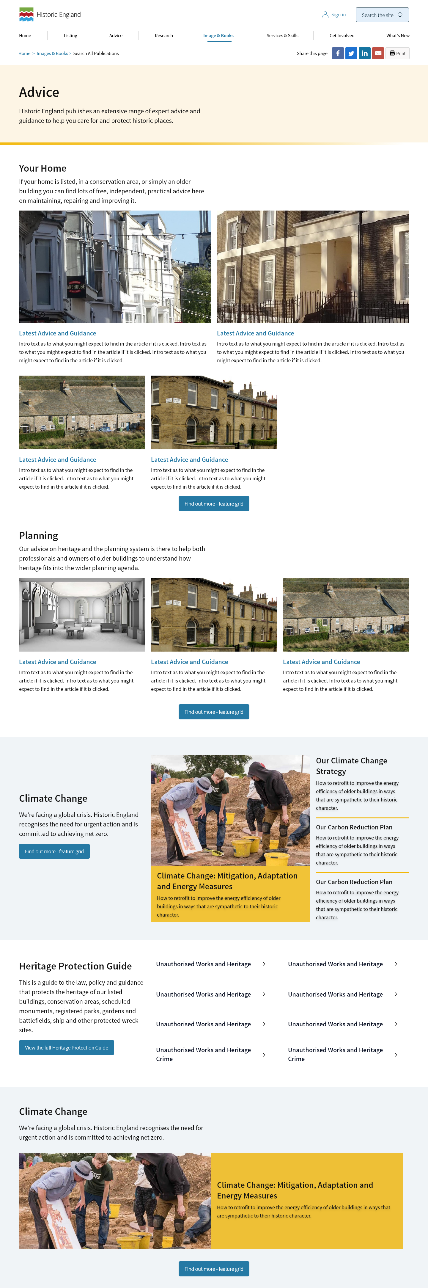
Old Design
The old design was uninspiring and confusing to the user. From user testing and our own discovery we found the following issues:
#1 Users found the components confusing due to the divider lines, arrows, CTA placement and spacing. This made it difficult to navigate and understand.
This meant that users often didn’t reach their end goal as they didn’t scroll further, got lost or assumed that there was nothing more on the page.
#2 The drop shadow looked outdated and made the design look even more boxy than it already was. This contributed to the user’s confusion with each component.
#3 The hero section had too much white space, was uninspiring, and was not aligned with the rest of the page.
#4 Some components looked incomplete if they were not fully populated, which also increased the amount of white space.


Design Options & Revisions
I created several design options; some had minimal changes and required little development time, while others were more complex and may have required a site-wide change.
In my designs, I explored:
#1 Background colour toggle to give the content team more options and better segments the sections of the page.
#2 Changing inconsistent CTA styling
As the users were confused by the type of links on the page. However, the option was not taken forward as more research had to be done before implmenting a site wide change.
#3 Image card sizing
Image size would change depending on how many cards there were to help with interest and reduce white space. However, a major consideration would be image quality which would possibly mean more editing for the content team.
#4 Using bolder colours that are more associated with the brand and help with engagement.
This would have meant that links would need to change colour in order to meet accessibility.
#5 Carousel use so that these components could be repurposed in the future on other pages where the users are more likely to explore rather than search. These would not be used on a regular landing page.
#6 Changing component layout based on the number of links
This would provide the content team with more component options. This would ensure that link based component looked good no matter how much text was present. With the current layout we had lots of unused space.
However, this would have required a lot of development time.


Accessibility and UX
Some of the UX considerations on this project were:
#1 Effective page layout and design
Simple and clean, providing a clear path to the user while being visually appealing.
#2 CTA placement for easy navigation to other landing pages
Clear and predictable positioning of the CTA to drive the user to the link.
#3 Content hierarchy on the page
Display core services first; these should be the most visually appealing. Other components such as the text links should be further down the page as these are less important and visual.
#4 Colour contrast, colour pairing and general accessibility
It was essential that the colours chosen were good for various visual impairments and passed the AA colour contrast.


Repurposing design
An example of how components could be repurposed on other, more explorative pages without needing much more development time.


Design – Dev Handover
To ensure there was clear communication and collaboration between designers and developers, I created design handoff documents and led handover meetings. This ensured smooth implementation.
Also, having a design review of the implemented product allowed us to work together and highlight any bugs before sending it to the testing team.

Outcome
According to users interviewed, they found the new pages less confusing and more engaging. They found it easier to get from A to B when landing on the right page.
As a result of some of the proposed within the project and the new WCAG requirements, link style will be addressed site wide. This will enable us greater colour choice and help with engagment.


Training Session
Following the design and delivery, I was also responsible for training up the content team on how to use the components correctly.
The main aspect of the training included:
- Colour combinations to avoid as these are not great combinations for the colour blind.
– blue and green
– yellow and green - Considering if a component should have a background colour.
- Creating a meaningful call-to-action text.
- Image quality.
- Content hierarchy, both on the page and within components. Leading with a feature component and avoiding using a list and tile component first.
Example presentations:


